
Creating a hero section that catches your visitors’ attention can set the tone for the rest of the website. If you’re looking for a creative way to use Divi’s sticky options to help you get there, you’ll love this tutorial. Today, we’re showing you how to reveal an underlying image grid in your hero with Divi’s sticky options. We’re including a very smooth transition from default to sticky and you’ll be able to download the JSON file for free as well!
Let’s get to it.
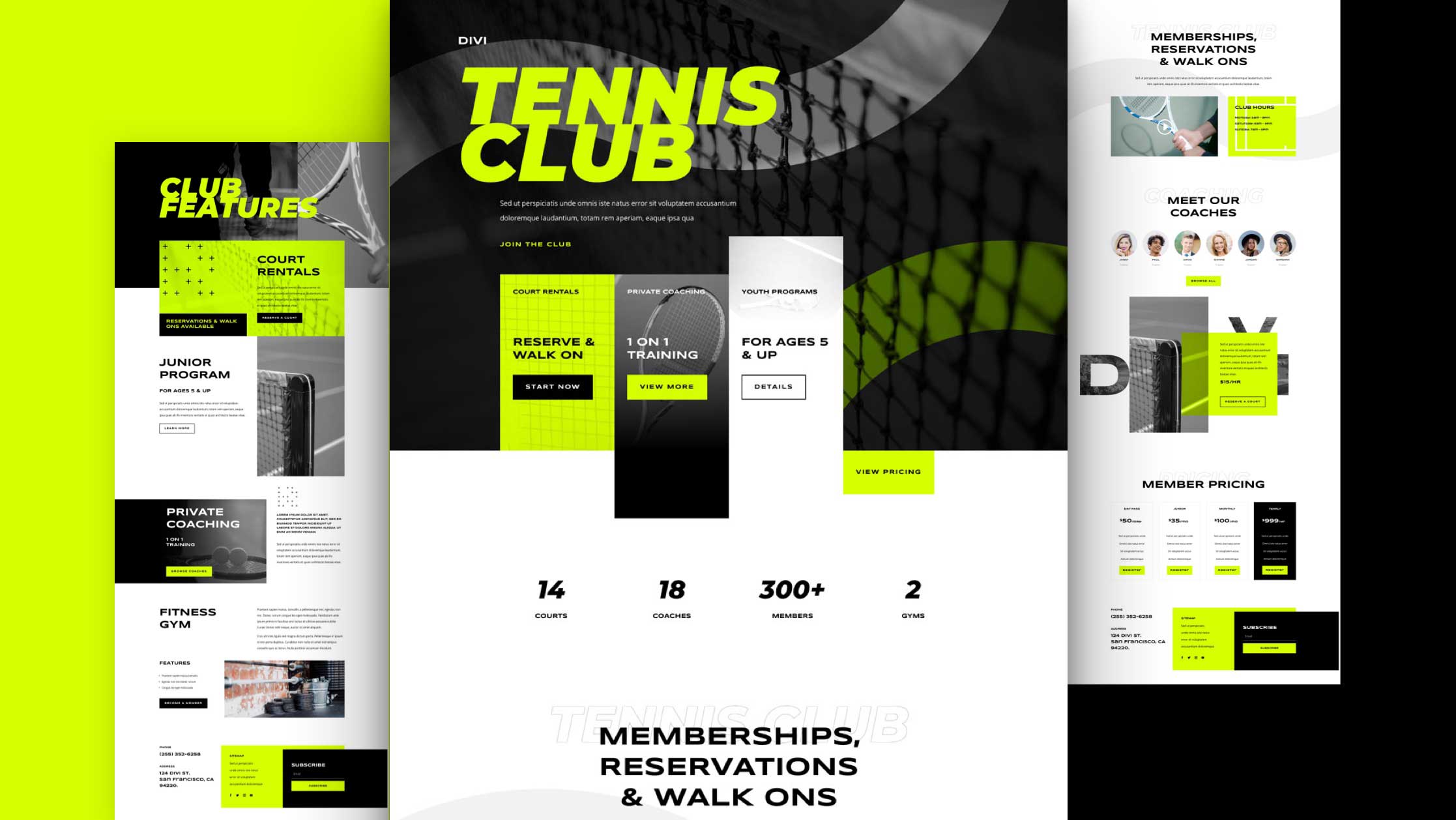
Preview
Before we dive into the tutorial, let’s take a quick look at the outcome across different screen sizes.
Desktop

Mobile

Download The Layout for FREE
To lay your hands on the free layout, you will first need to download it using the button below. To gain access to the download you will need to subscribe to our Divi Daily email list by using the form below. As a new subscriber, you will receive even more Divi goodness and a free Divi Layout pack every Monday! If you’re already on the list, simply enter your email address below and click download. You will not be “resubscribed” or receive extra emails.

1. Create Hero Design
Add New Section
Background Color
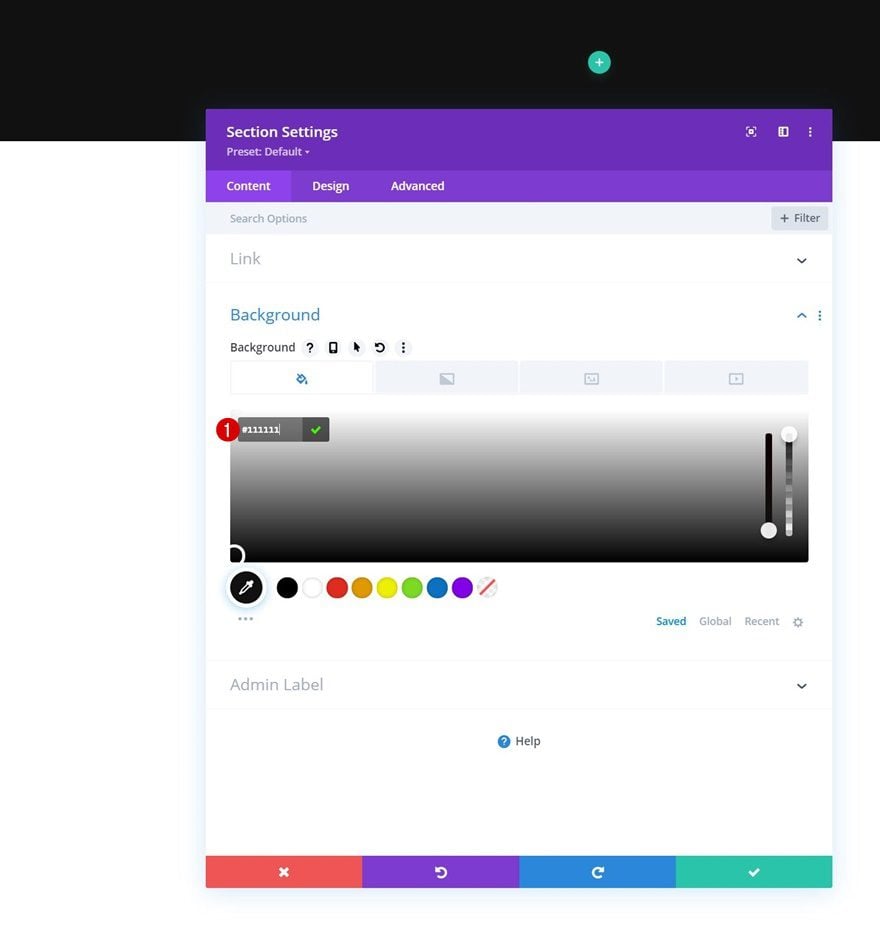
Start by adding a new section to the page you’re working on. Open the section settings and add a background color.
- Background Color: #111111
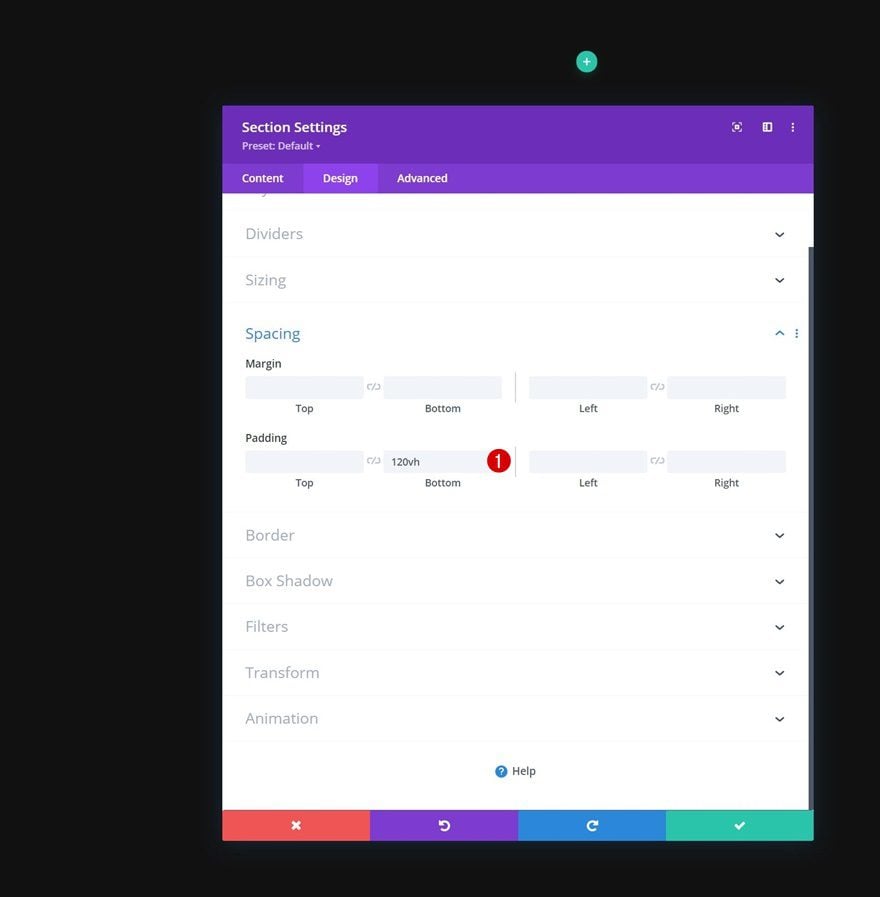
Spacing
Go to the section’s design tab and add some bottom padding. This bottom padding will give us enough space to create the scrolling experience.
- Bottom Padding: 120vh
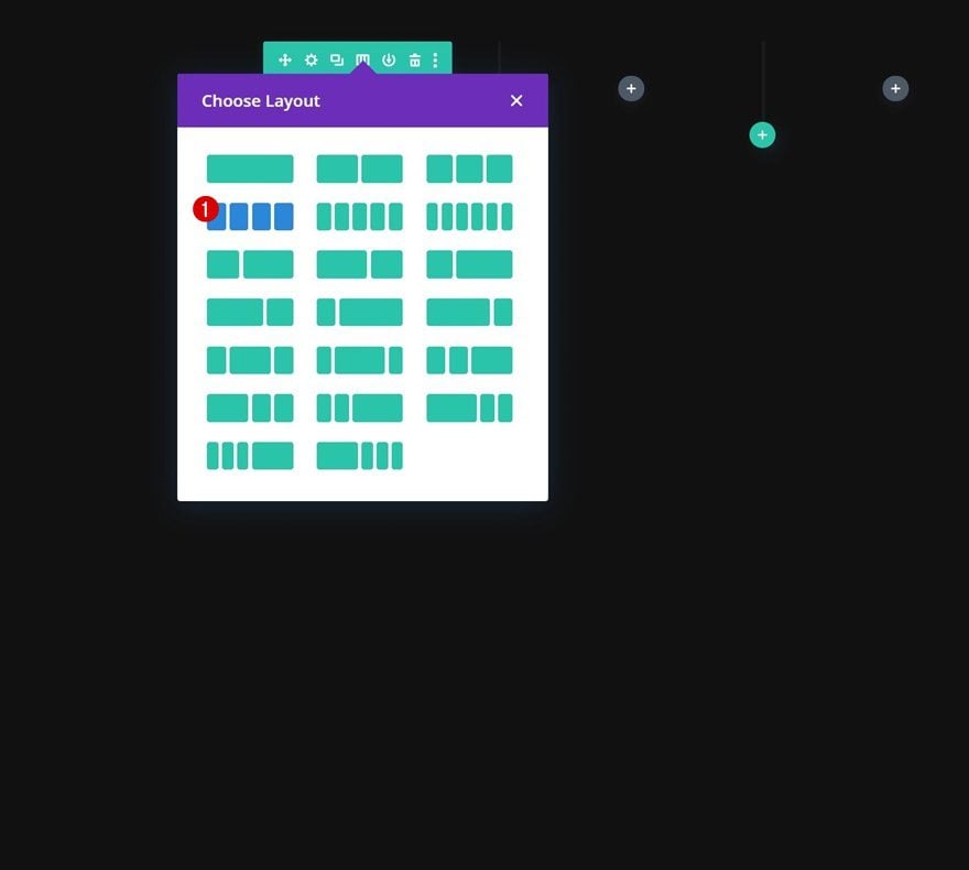
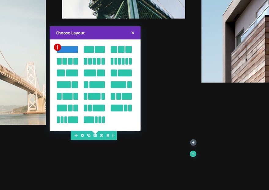
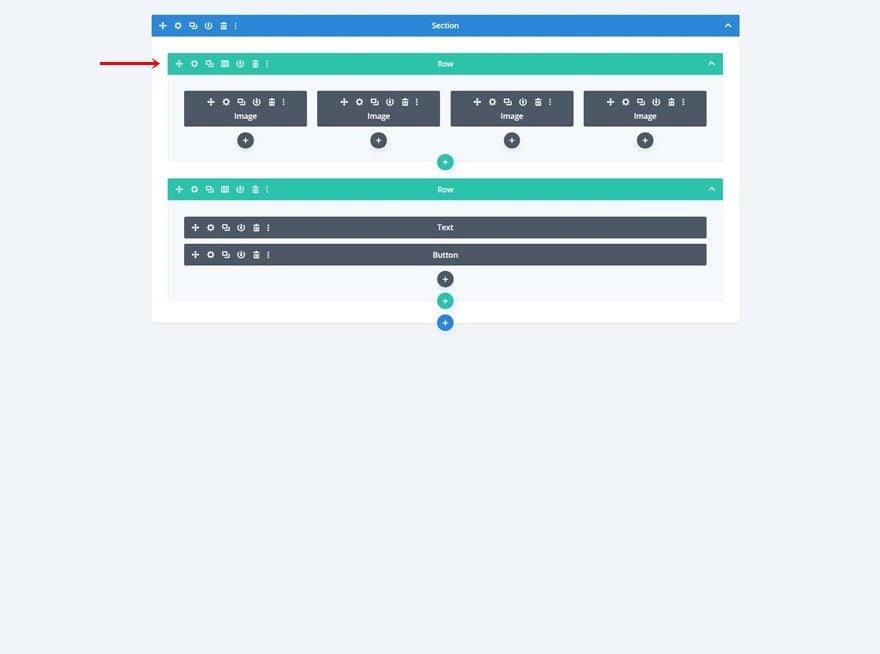
Add Row #1
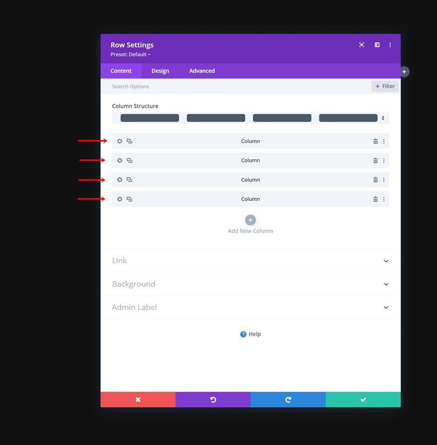
Column Structure
Continue by adding a new row using the following column structure:
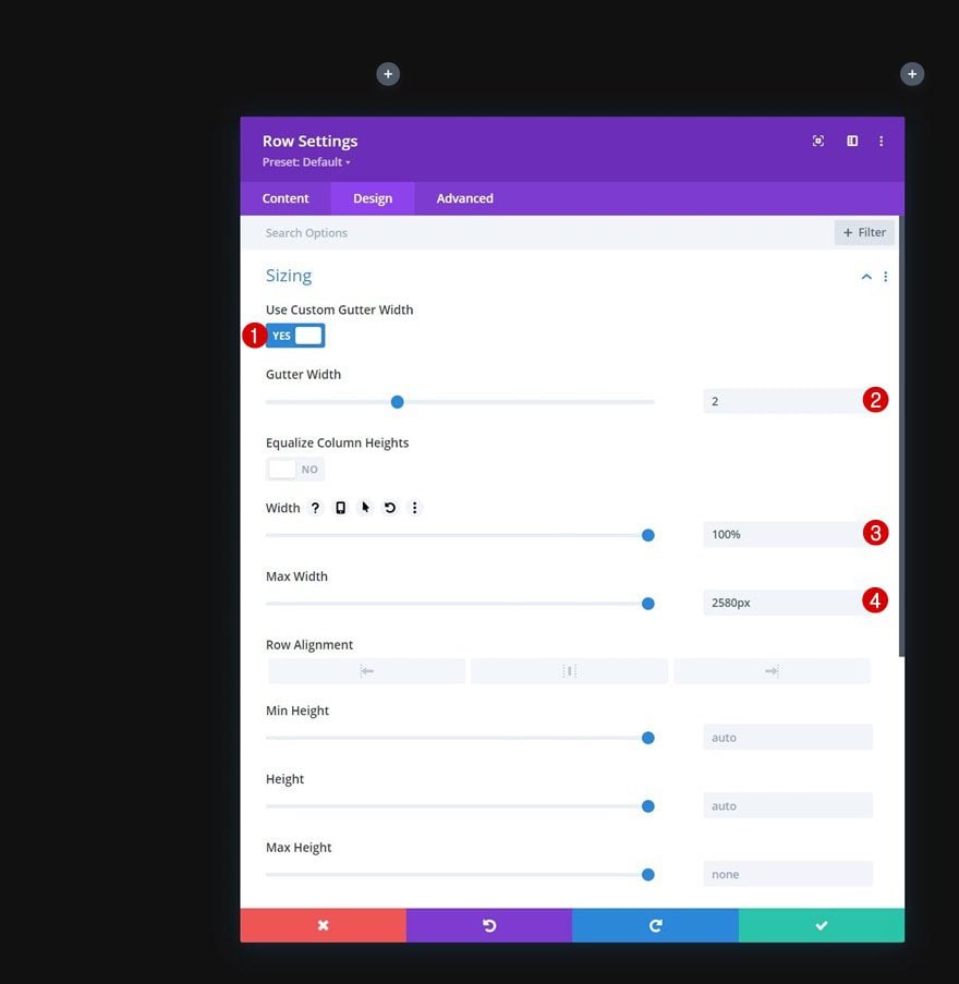
Sizing
Without adding modules yet, open the row settings, go to the design tab and change the sizing settings as follows:
- Use Custom Gutter Width: Yes
- Gutter Width: 2
- Width: 100%
- Max Width: 2580px
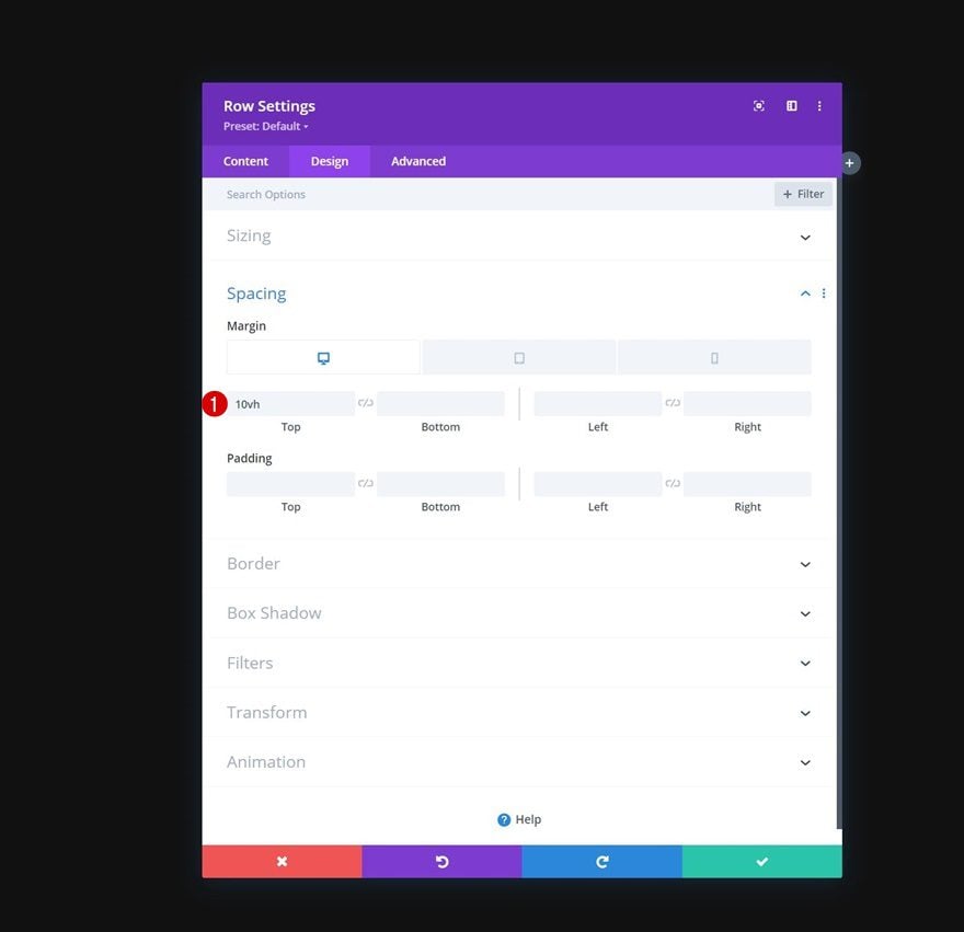
Spacing
Add some responsive top margin next.
- Top Margin:
- Desktop: 10vh
- Tablet & Phone: 5vh
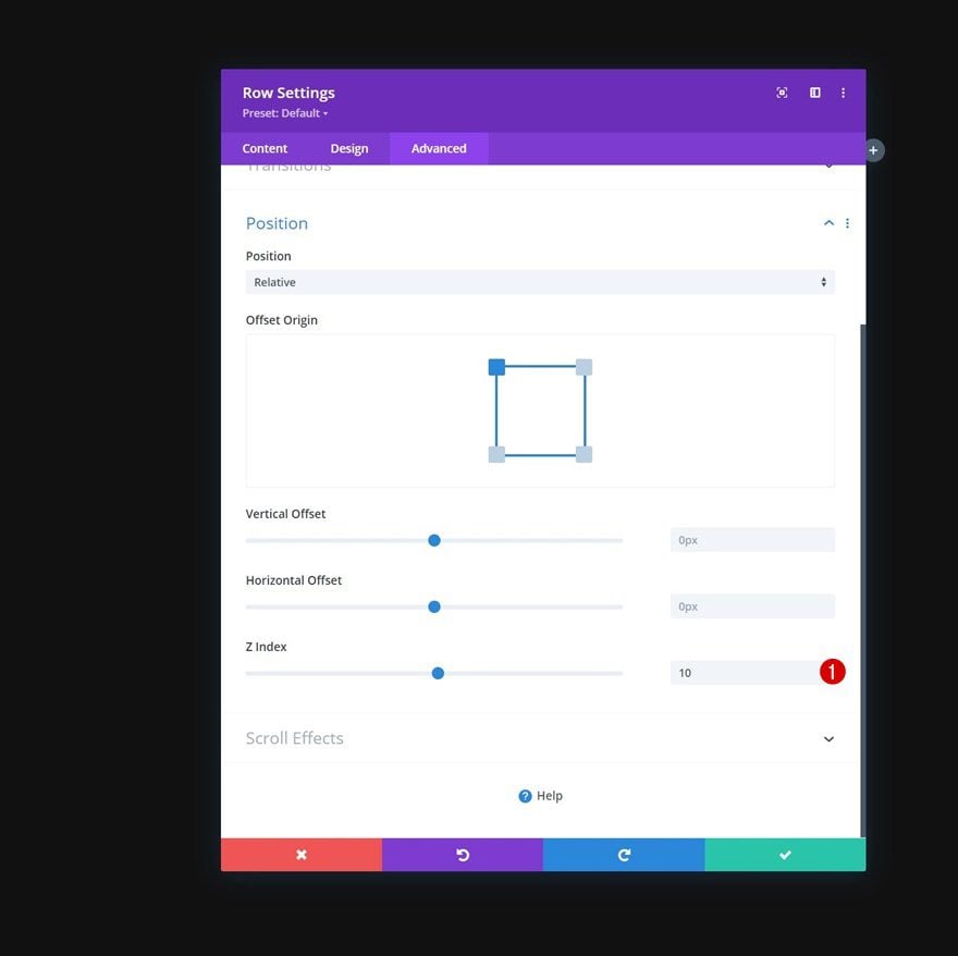
Z Index
And to make sure this row stays below the second row we’ll add to this section, later on, we’re going to use a z index of 10 in the advanced tab.
- Z Index: 10
All Column Settings
Once the general row settings are done, open each one of the columns individually.
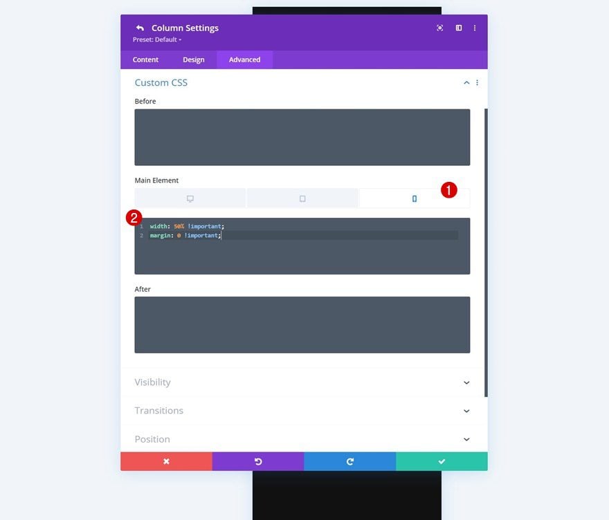
Main Element CSS
In each one of the columns, apply the following lines of CSS code to the main element on phone:
Phone only:
width: 50% !important;
margin: 0 !important;
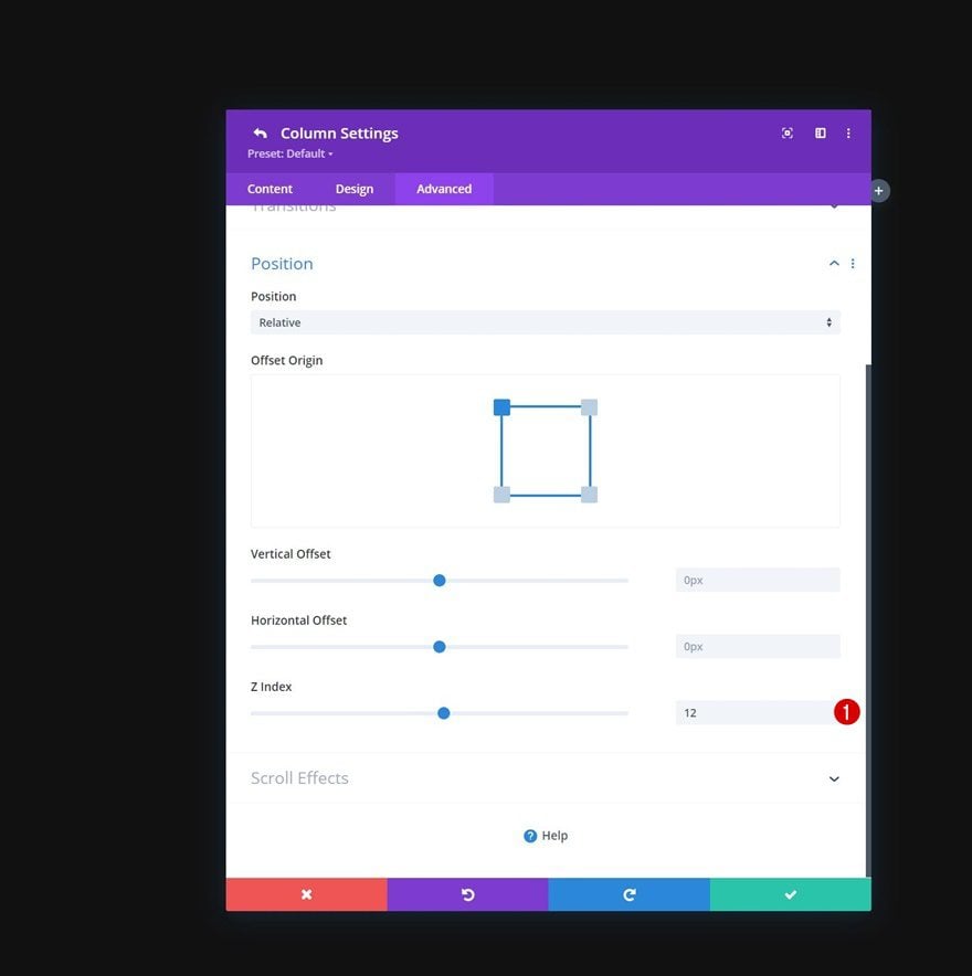
Column 2 Settings
Then, open the column 2 settings.
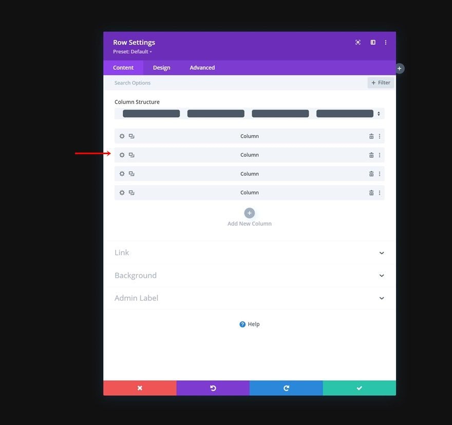
Z Index
And increase the Z Index to 12. This will put this column above the third column.
- Z Index: 12
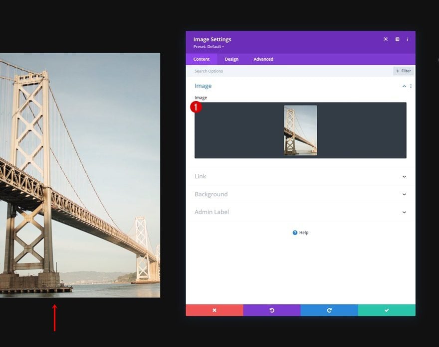
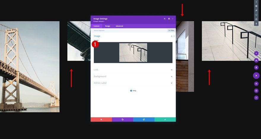
Add Image Module to Column 1
Upload Image
Time to add modules, starting with an Image Module in column 1. Upload an image of your choice.
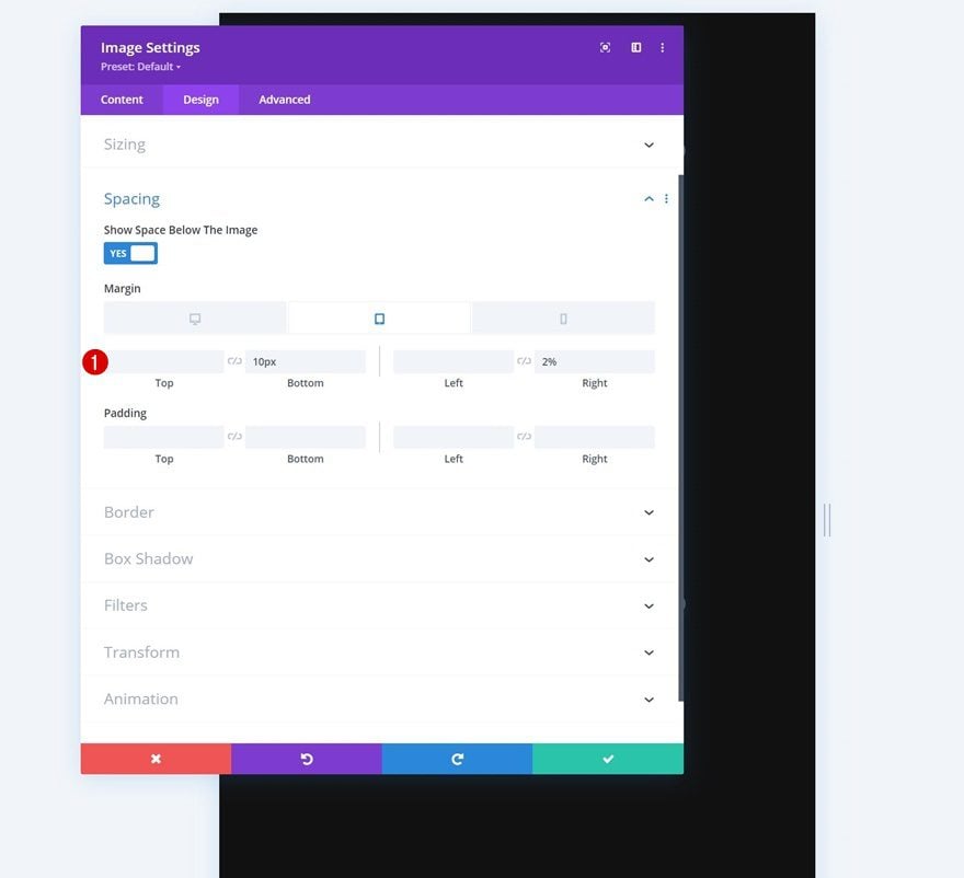
Spacing
Move on to the module’s design tab and change the spacing settings as follows:
- Bottom Margin:
- Tablet & Phone: 10px
- Right Margin:
- Tablet & Phone: 2%
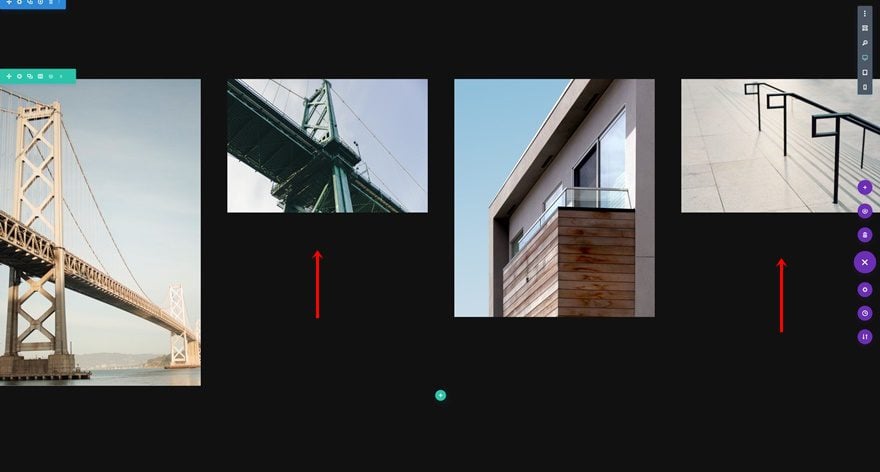
Clone Image Module Three Times & Place Duplicates in Remaining Columns
Once you’ve completed the module settings, you can clone the entire module three times and place the duplicates in the remaining columns of the row.
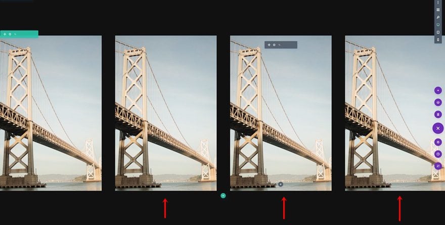
Change Images
Make sure you change the image in each duplicate module.
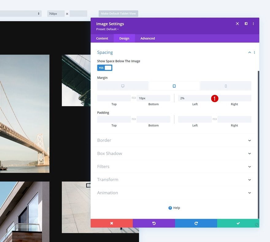
Change Image Module #2 & #4 Spacing
Then, open the settings of the Image Modules in column 2 and 4, and apply the following spacing values to them:
- Bottom Margin:
- Tablet & Phone: 10px
- Left Margin:
- Tablet & Phone: 2%
- Right Margin: /
Add Row #2
Column Structure
Continue by adding a new row to the section using the following column structure:
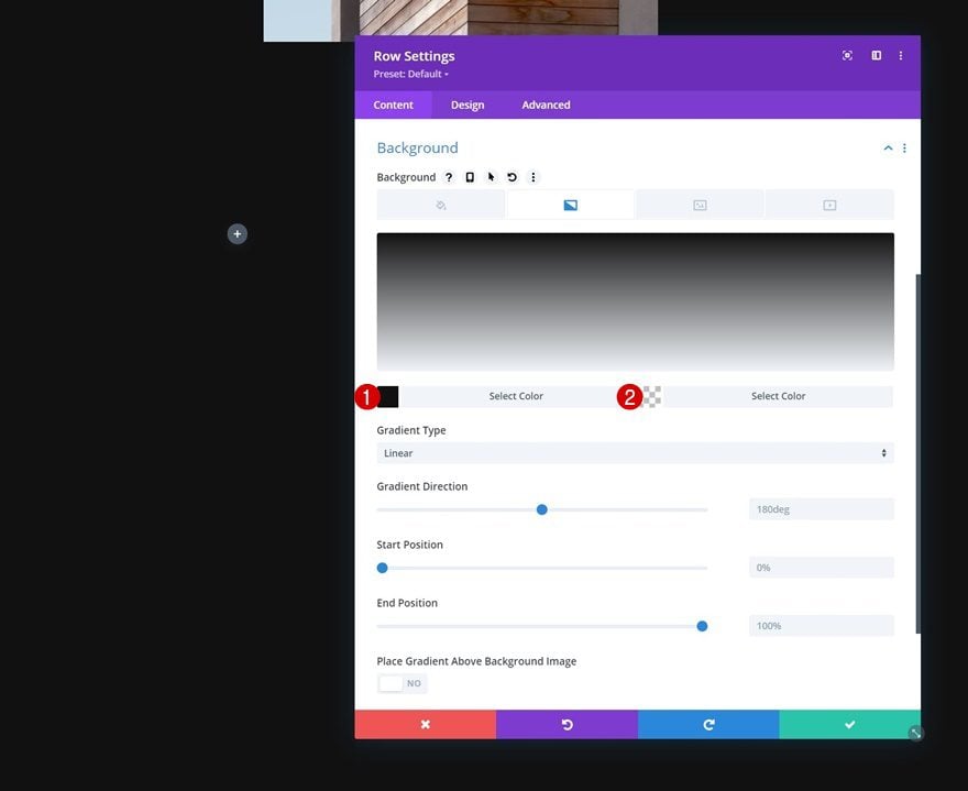
Gradient Background
Open the row settings and apply the following gradient background:
- Color 1: #111111
- Color 2: rgba(255,255,255,0)
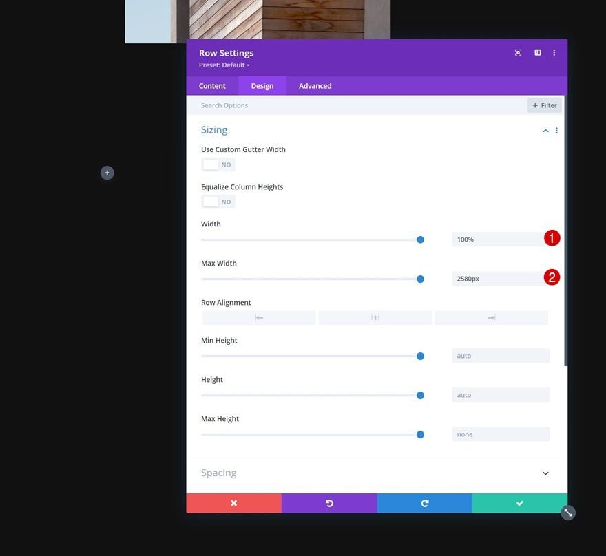
Sizing
Modify the sizing settings next.
- Width: 100%
- Max Width: 2580px
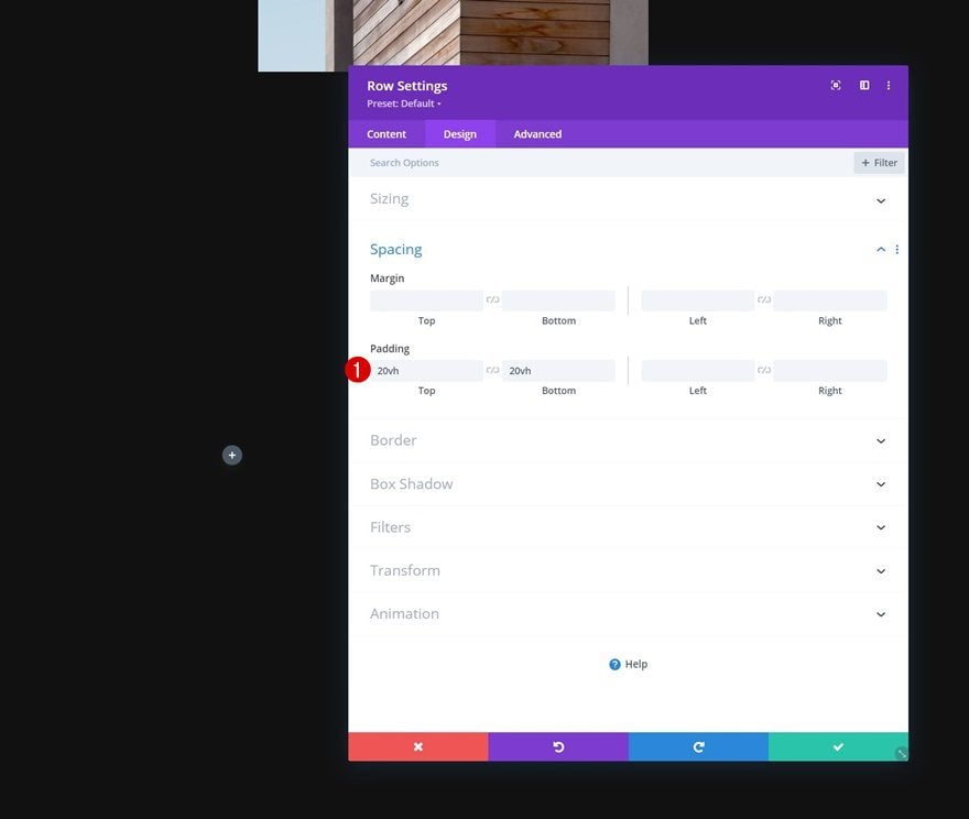
Spacing
Then, apply some top and bottom padding.
- Top Padding: 20vh
- Bottom Padding: 20vh
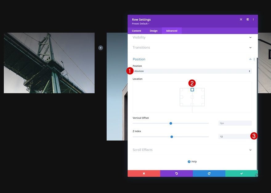
Position
To place this row on top of the image grid, we’re going to use the position settings accordingly:
- Position: Absolute
- Location: Top Center
- Z Index: 12
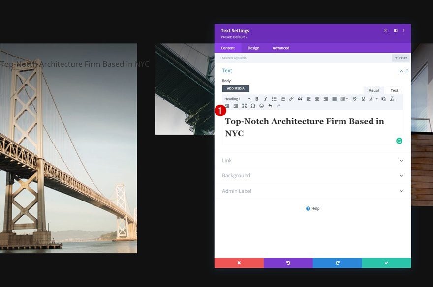
Add Text Module to Column
Add H1 Content
Add a first Text Module to this row using some H1 content of your choice.
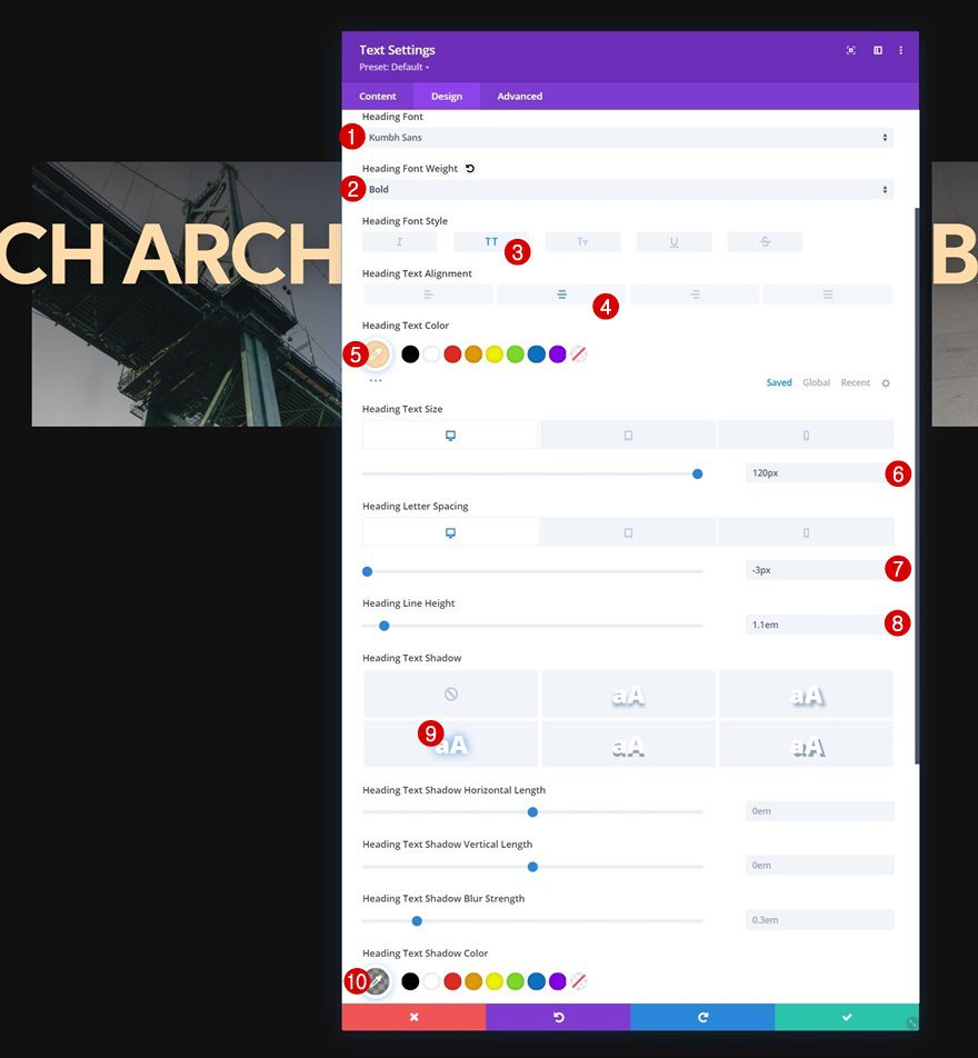
H1 Text Settings
Move on to the module’s design tab and change the H1 text settings accordingly:
- Heading Font: Kumbh Sans
- Heading Font Weight: Bold
- Heading Font Style: Uppercase
- Heading Text Alignment: Center
- Heading Text Color: #ffdbaa
- Heading Text Size:
- Desktop: 120px
- Tablet: 60px
- Phone: 40px
- Heading Letter Spacing
- Desktop: -3px
- Tablet & Phone: 0px
- Heading Text Shadow:
- Select: Third Option
- Heading Text Shadow Color: rgba(0,0,0,0.4)
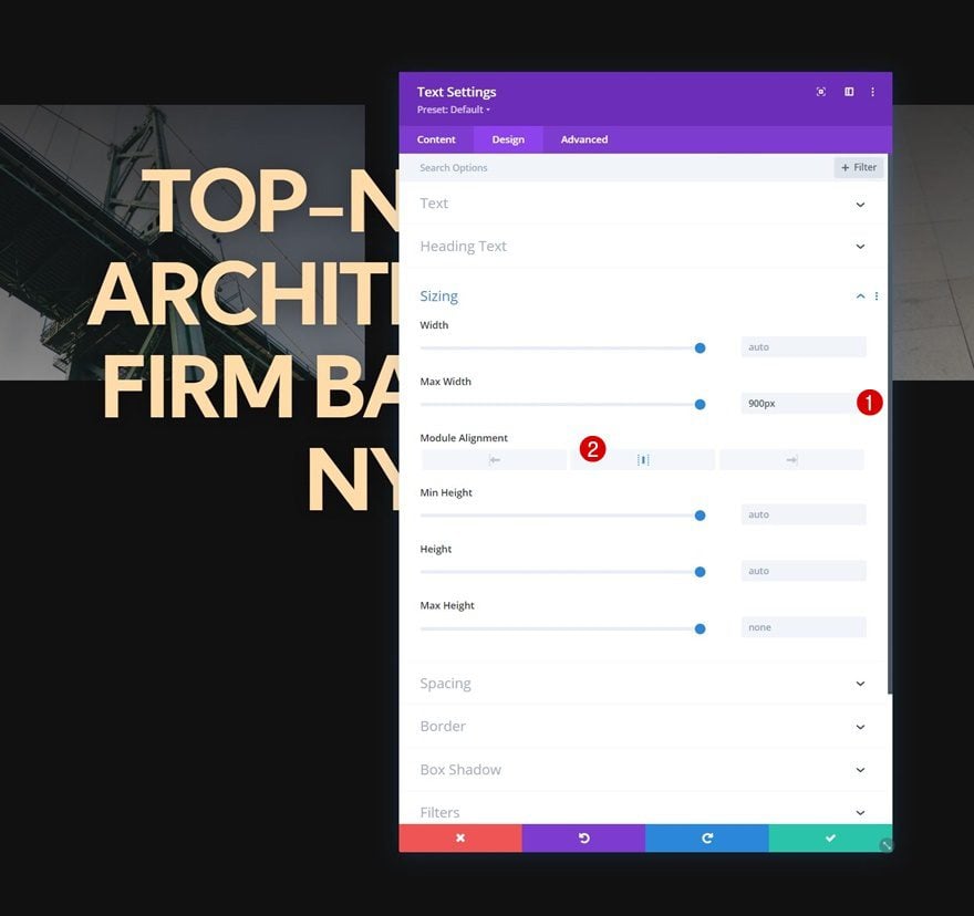
Sizing
Modify the sizing settings next.
- Max Width: 900px
- Module Alignment: Center
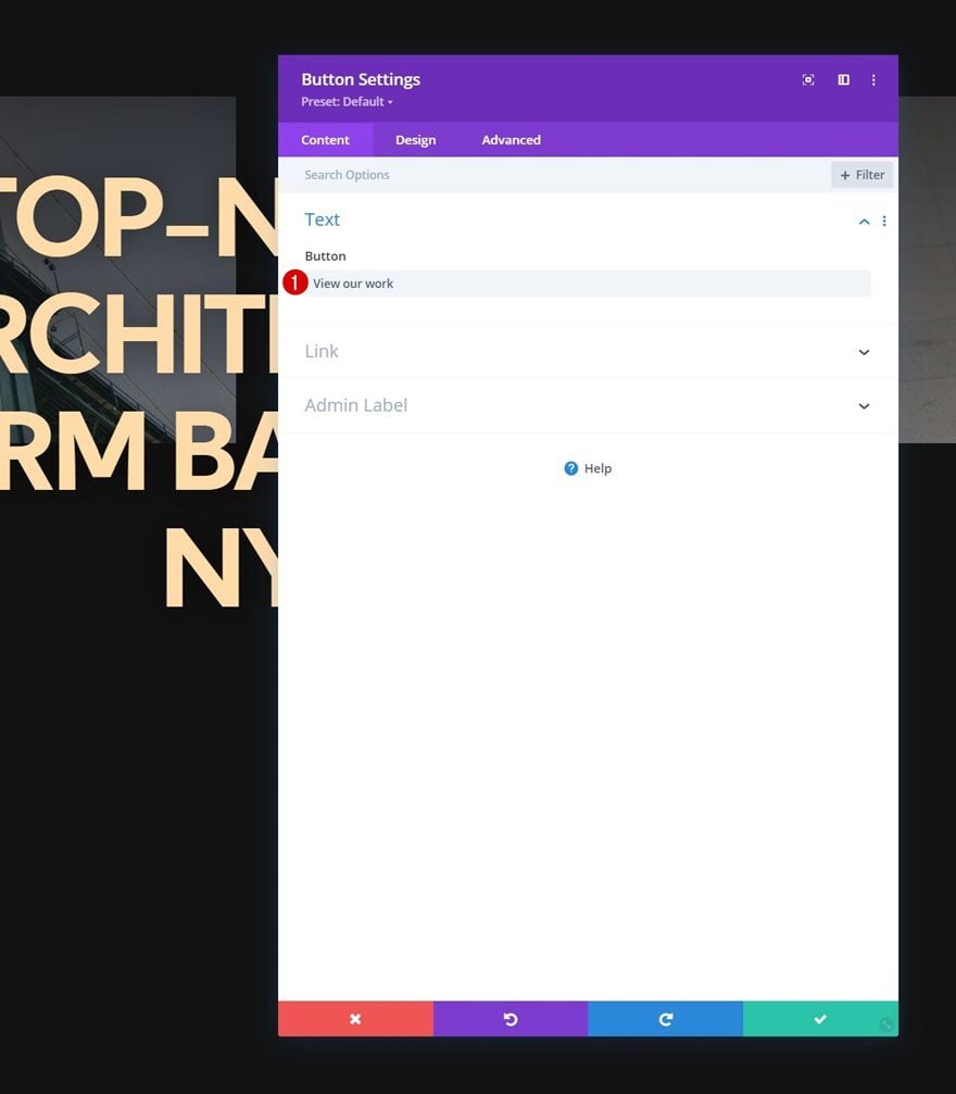
Add Button Module to Column
Add Copy
The next and last module we need in this row is a Button Module. Add some copy of your choice.
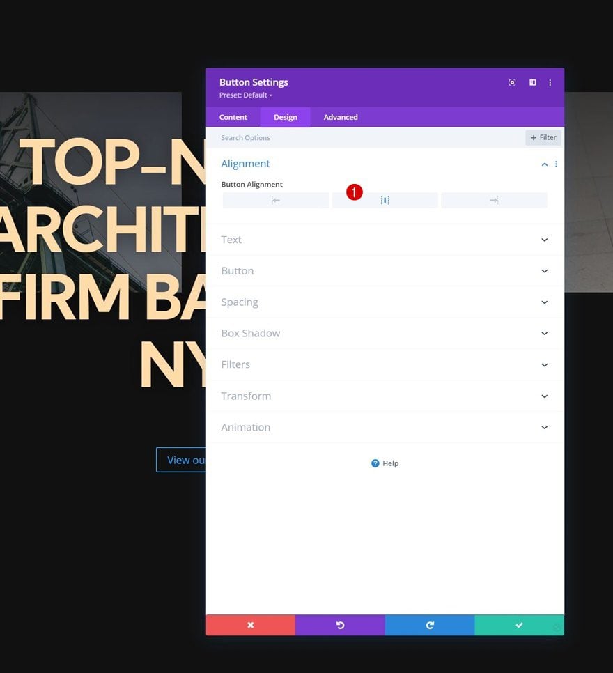
Button Alignment
Move on to the design tab and change the button alignment.
- Button Alignment: Center
Button Settings
Then, style the button.
- Use Custom Styles For Button: Yes
- Button Text Size:
- Desktop: 20px
- Tablet: 16px
- Phone: 14px
- Button Text Size: #111111
- Button Background Color: #ffffff
- Button Border Width: 0px
- Button Border Radius: 100px
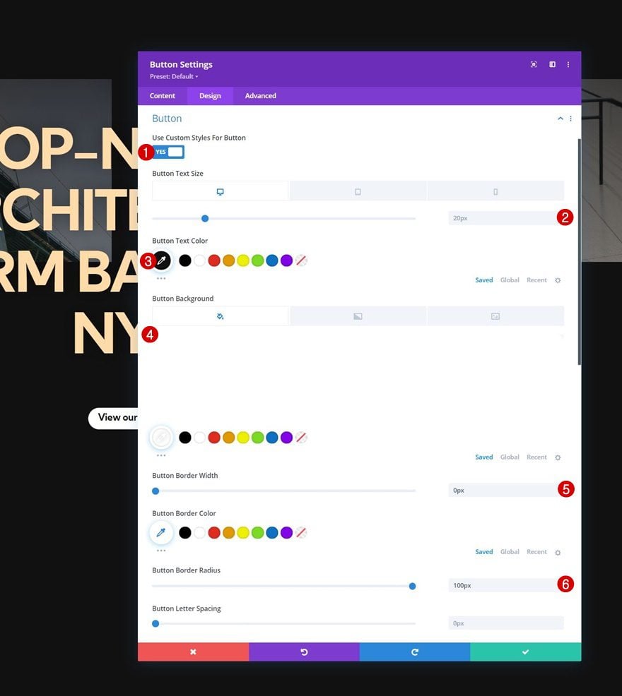
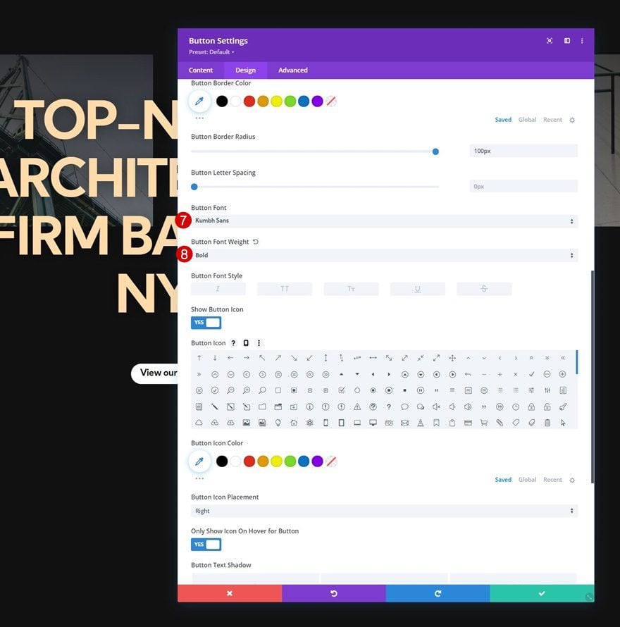
- Button Font: Kumbh Sans
- Button Font Weight: Bold
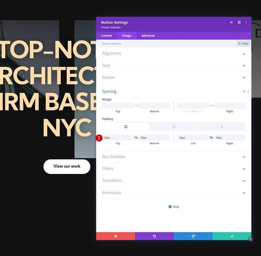
Spacing
And use some responsive padding values in the spacing settings.
- Top Padding:
- Desktop & Tablet: 20px
- Phone: 15px
- Bottom Padding:
- Desktop & Tablet: 20px
- Phone: 15px
- Left Padding:
- Desktop & Tablet: 50px
- Phone: 40px
- Right Padding:
- Desktop & Tablet: 50px
- Phone: 40px
2. Apply Sticky Settings
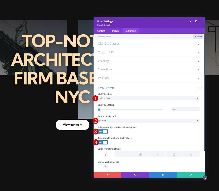
Turn Row #1 Sticky
Now that we have all the elements in place, we can focus on the sticky settings. Open the first row’s settings and apply the following sticky settings:
- Sticky Position: Stick to Top
- Bottom Sticky Limit: Section
- Offset From Surrounding Sticky Elements: Yes
- Transition Default and Sticky Styles: Yes
Sticky Opacity
Then, change the opacity in the filters settings.
- Default: 20%
- Sticky: 100%
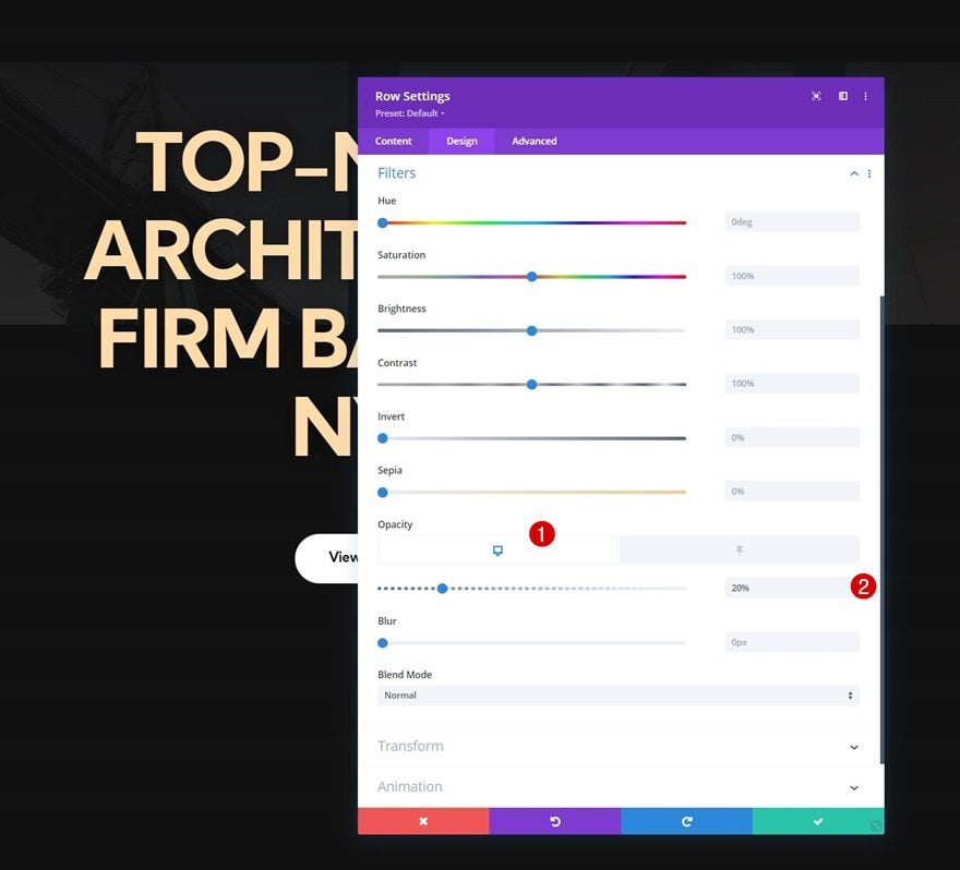
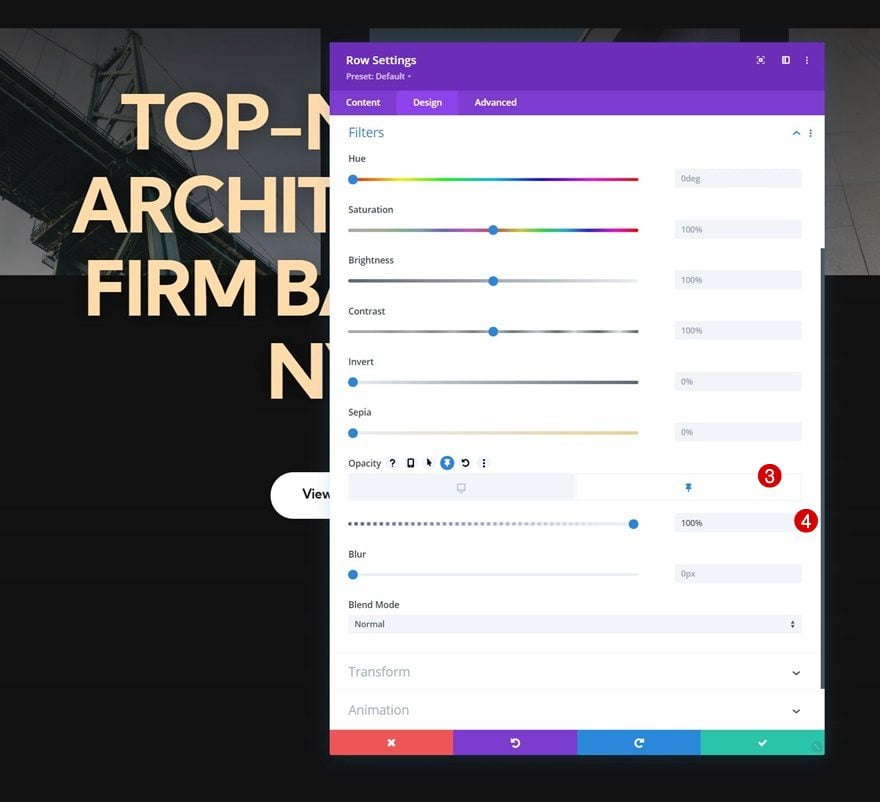
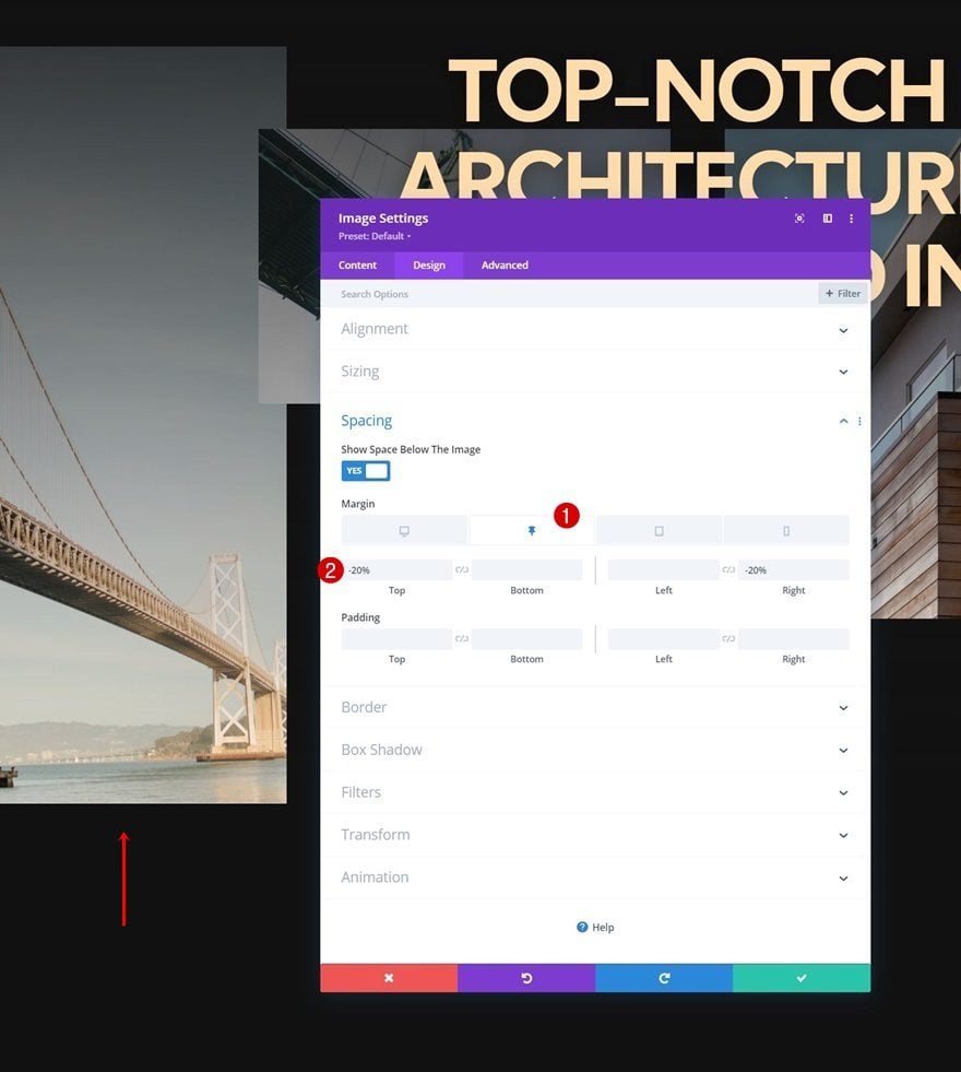
Image Module #1 Sticky Settings
Spacing
Next, open the settings of the Image Module in column 1. Move on to the design tab and add some sticky top and right margin.
- Sticky Top Margin: -20%
- Sticky Right Margin: -20%
Transition
Increase the transition duration as well.
- Transition Duration: 700ms
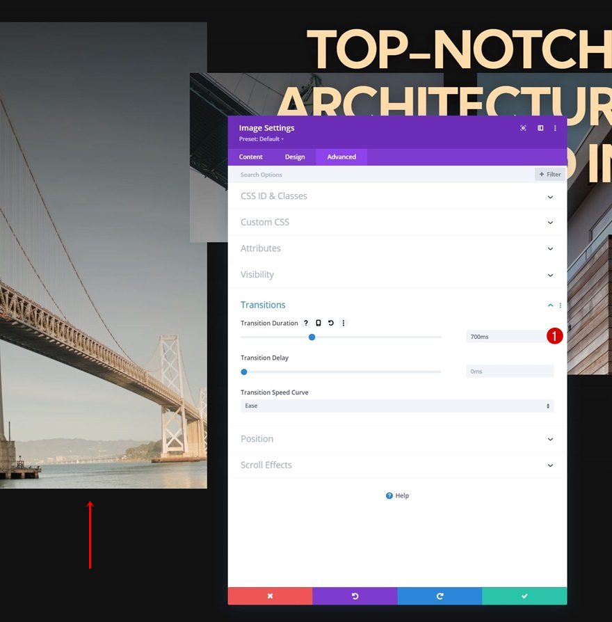
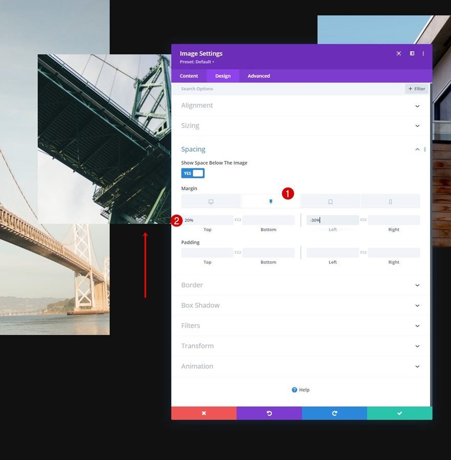
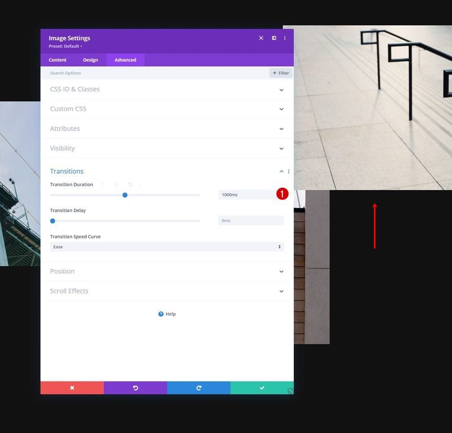
Image Module #2 Sticky Spacing
Spacing
Move on to the Image Module in column 2 and use the following sticky spacing settings:
- Sticky Top Margin: 20%
- Sticky Left Margin: -30%
Transition
Increase the transition duration here too.
- Transition Duration: 1000ms
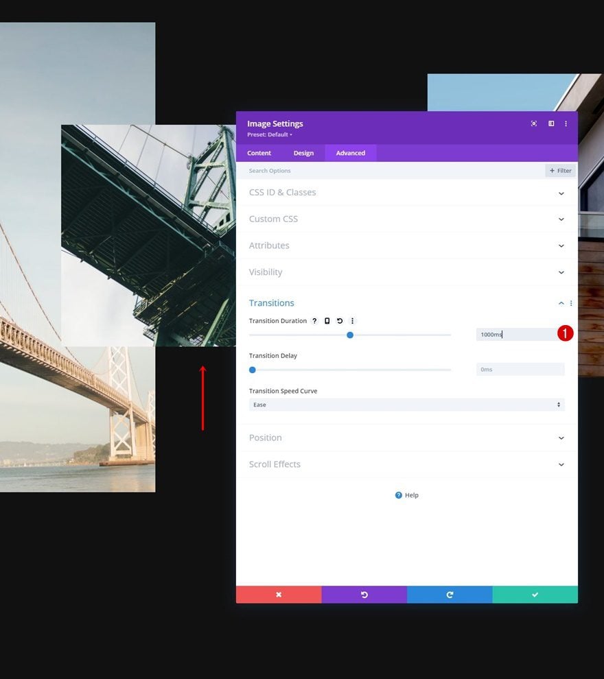
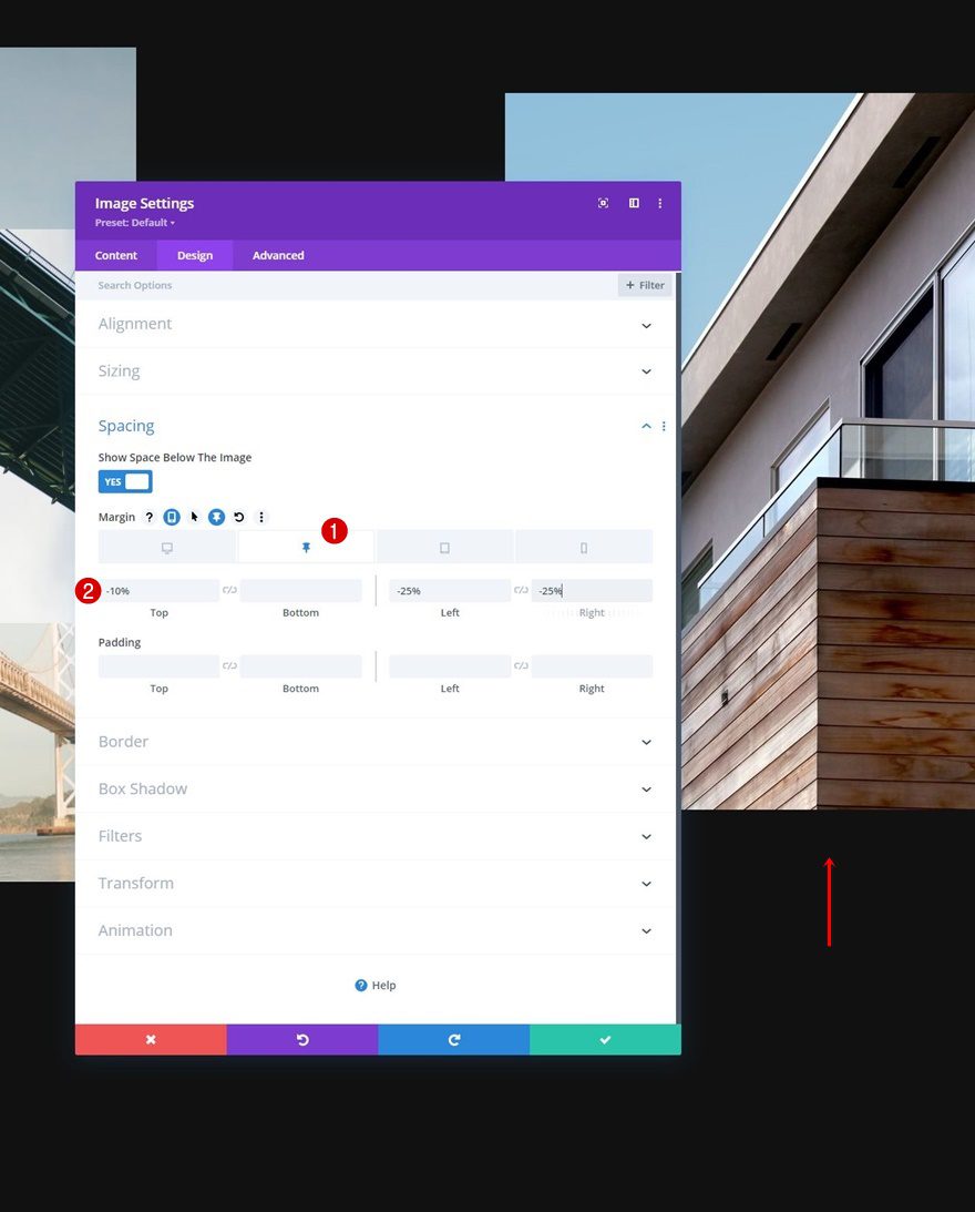
Image Module #3 Sticky Spacing
Spacing
Next up, we have the Image Module in column 3. Use the following sticky spacing values:
- Sticky Top Margin: -10%
- Sticky Left Margin: -25%
- Sticky Right Margin: -25%
Transition
Change the transition duration accordingly:
- Transition Duration: 700ms
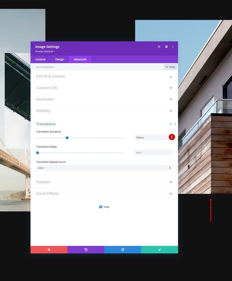
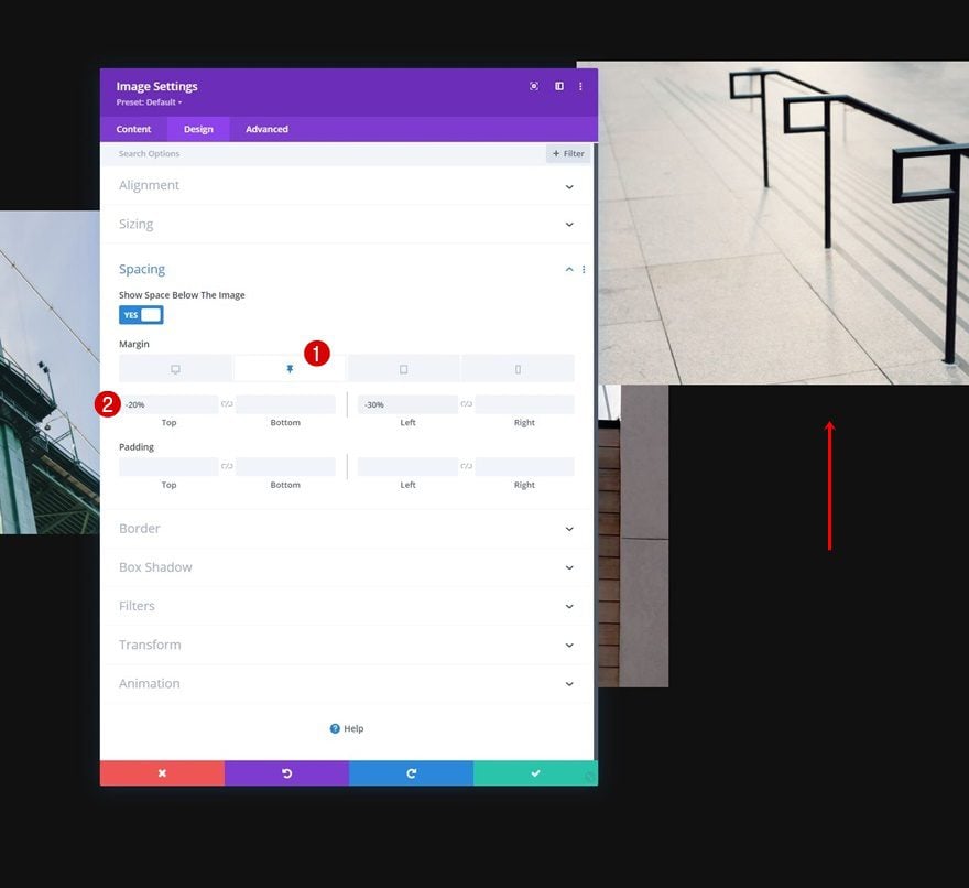
Image Module #4 Sticky Spacing
Spacing
And lastly, open the Image Module in column 4. Apply the following sticky spacing values:
- Sticky Top Margin: -20%
- Sticky Left Margin: -30%
Transition
Complete the module settings, and this tutorial, by increasing the transition duration. That’s it! Save and exit the page to see the outcome.
- Transition Duration: 1000ms
Preview
Now that we’ve gone through all the steps, let’s take a final look at the outcome across different screen sizes.
Desktop
Mobile
Final Thoughts
In this post, we’ve shown you how to get creative with your hero section in Divi. More specifically, we’ve shown you how to reveal an image grid on scroll using Divi’s sticky sections. You were able to download the JSON file for free as well. If you have any questions or suggestions, feel free to leave a comment in the comment section below.
If you’re eager to learn more about Divi and get more Divi freebies, make sure you subscribe to our email newsletter and YouTube channel so you’ll always be one of the first people to know and get benefits from this free content.

Leave A Reply